 |
Evolution Links to our Past News of the Present Insight for the Future |

© Linnean Society of London |
Common Descent Described Graphically
| Family Trees, Cladograms, Phylogenies, Charts of Ancestry |
|
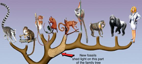
Graphic by Mark A. Klinger, Carnegie Museum of Natural History, Pittsburgh
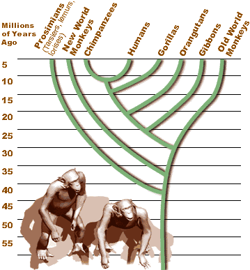
We have loved Mark Klinger's painting of the primate family tree ever since we stumbled across it while making a series of pages covering
the world of primates. It shows representative species of Lemurs, Prosimians, New and Old World Monkeys and the Great Apes, including humankind.
There is no timeline illustrated and the branching is not intended to convey a precise picture of lines of descent. It is fine art where form
and color balance is as important as any scientific details. Adding a Gibbon swinging from branch-to-branch is unnecessary.
|
| Depicting Species and Genera Over Time |
|
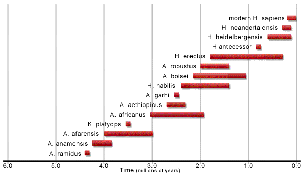
News organizations turn out some sophisticated artwork to illustrate articles on websites or in magazines and science journals. I changed
The orientation of the first chart was changed without changing the numerals. Editorial matter that had been at the head and foot
of the graphic was eliminated. One might wonder about the length of time assigned to some of the genera in comparison to the chart that follows it.
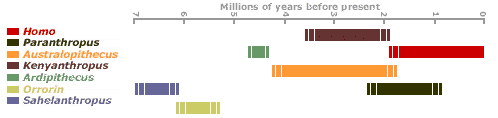
This chart appeared in a review article in the journal Nature. It appears on the talkorigins.org website with a colored background.
The type has been reset for better legibility here and the colors modified a little. There was no attempt in this graphic to link species in line
of descent. It is interesting to note that almost half of the 19 intermediate species were judged to be lacking sufficient evidence to
positively rank cranial capacity, dentition or degree of bipedalism. Although there are lots of fossils, more and better are needed for some species.
 |
| Cladograms Illustrate Lines of Descent |
|
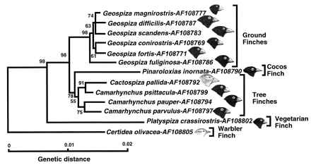
The science of cladistics dates to the 1950s. It produces cladograms, which can be thought of as family trees in which subjective decisions are
reduced or removed. A cladogram is said to be fully resolved if all the species represented can be arranged in monophyletic clades
(a group of species and, if possible, its parent species). An unresolved cladogram includes paraphyletic group that cannot be resolved given the
available data. In this cladogram for Darwin's Finches, the bottommost group of three species is said to be unresolved. The red dots indicate
branching points in evolution, resulting in "sister groups" of species.
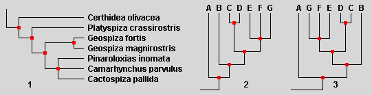
Cladograms may be oriented in any direction although, for readability, they most often are shown similar to (1). Example (2) here is identical to
(1) except that letters have been supstituted for the names of species. Example (3) is cladistically equivalent to (2). For this demonstration some cladeshave
been rotated about their ancestral node. The point to be made is that the order of the list of names has nothing at all to do with the genealogical
relationships. Only branching points do. The relationship of species B through G to species A is the same in all three diagrams.
Bootstrap values are computed by cladistics software which tests all of the data available to find the "most parsimonious" or simplest arrangement
possible for the species under study. High values are viewed with more confidence than low values. The same character or characters can be better
indicators of relationships in some cases than in others. The greatest confidence is usually obtained in studies that test a great number of characters
simultaneously, or when several different studies, examining different characters, end up in close agreement.
|
| Indicating Evolutionary Lines of Descent |
| Linnaean vs. Cladistic Taxonomies |
|
Since the 1700s science has grouped living organisms into what are termed Linnaean taxonomic categories such as species, genera, families, orders
and so forth. These are not sufficient to handle all the divisions within the tree of life that modern science is capable of detecting. So, today,
we tend to see other taxonomic treatments in use (particularly cladistics) or a hybridized combination of methods. Sometimes we will see two graphical
presentations that simply cannot agree with each other. Pay attention to the red branching points.
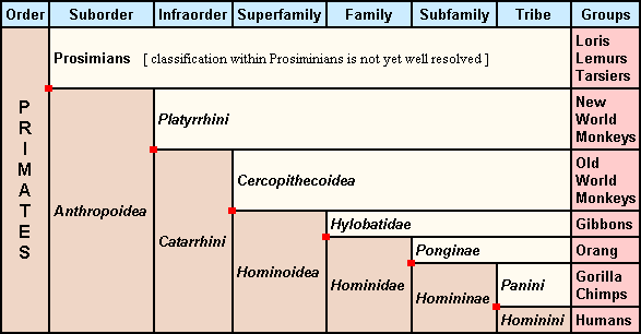
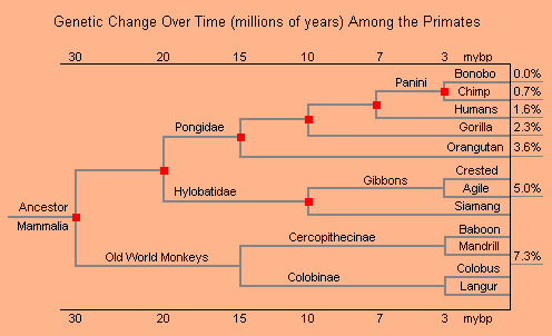
In the arrangement shown above, gorilla and chimps are placed in one tribe while humans are in an equal tribe or sister group (taxon). A red dot
indicates the branching point. But in the arrangement below, where clades are shown within clades, humans and chimps belong to one clade and
gorilla is a sister group. The two arrangements are not compatible. Virtually all scientists now agrees that the branching arrangement
shown below is to be preferred, based both on the fossil record and on genetic evidence.
The dates and genetics distances shown on Diamond's cladogram have stood up pretty well for the last 10 years. The more sophisticated genetic studies
that are now possible may change the reported genetic distances, if not the relationships. It will probably be years before comparisons can be made
between whole genomes, except in a few cases. Using different small segments of genomes for comparison (mtDNA, X or Y chromosomes, or specific groups
of genes) are bound to yield at least slightly different results.
|
| Finer and Finer Detail, Clades within Clades |
|
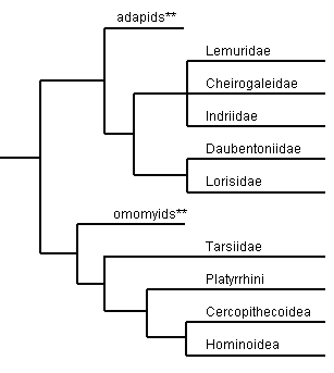
There are millions of species in the world. To print a single cladogram for them, even if only at the generic level, is impossible. The best we
can do is to make a large series of cladograms based on current evidence (and on which different authors may disagree). Over time, as new and
better evidence becomes available, things become clearer and depictions of the tree of life changes. Our representations of knowledge can be no
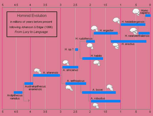
better than the current data which supports them. Following Colin Tudge in The Variety of Life we present cladograms to the level of genus
on the Primate Pages, followed by species lists for each genera. The first cladogram below shows details at the
level family or higher within the order that includes all primates. Some fossil species are shown, and three families within the Prosimians are
not resolved. You may notice that the Tarsiers are not here placed with the Prosimians as they are in that graphic from the Philadelphia Inquirer
near the top of this page. For each terminal branch on this cladogram, additional cladograms will be required to list all genera within the family.
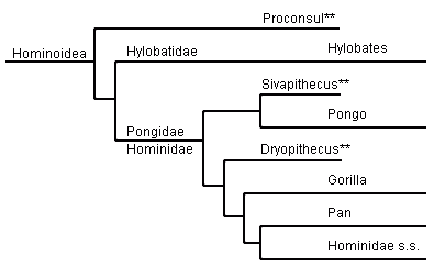
Hominoidea is the superfamily (great apes) that contains two living families, the Gibbons and all the rest. A cladogram for the Gibbons is shown below.
You can flip a coin to decide whether to call the rest Pongidae or Hominidae. Hominidae s.s. means "sensu stricto" or in the strictest (that is, most restrictive) sense.
That taxon contains living Humans and their ancestral species (fossils) back to the time of the split from our common ancestor with Chimpanzees.
Finally, we can get down to listing all the species in a family or genus. The Hylobatidae or Gibbons are shown below. The arrangement is based on the
number of chromosomes found in the genomes of these primates. Notice in the caption that the term "provisional" was used. Indeed, all facts in science
are provisional, as are the hypotheses derived from them. On the page listing these species we retained the common practice of placing them all in a single genus.
We suspect that the chromosomal hypothesis will be confirmed and taxonomies will change.
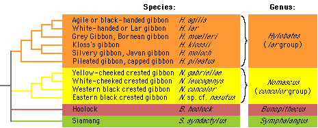
Fig.: Provisional classification of the Hylobatidae. From: Gibbon Research Lab. Divisions based upon diploid chromosome counts: Hylobates 44, Nomascus 52, Bunopithecus 38, Symphalangus 50. The name Hylobates is here retained. |
| Alternative Methods for Conveying Information |
|
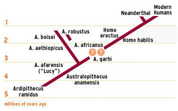
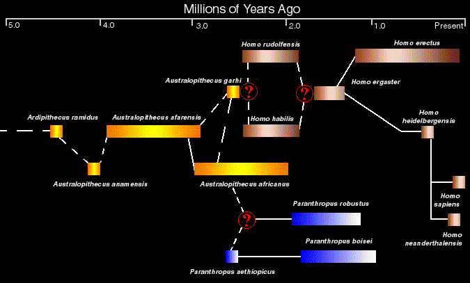
Diagonal cladograms or schematics are very popular in technical literature. I think they can sometimes be unintentionally confusing. For instance,
the straight line from Ardipithecus ramidus to Modern Humans as depicted here might suggest anagenesis, or species replacing species in linear fashion.
Cladogenesis, on the other hand, would be rich in branching events. This cladogram shows only two such branchings in the last 5 million years
(plus two appropriate question marks. Perhaps this illustration was intended to stimulate discussion in a classroom, where a professor would remove ambiguities.
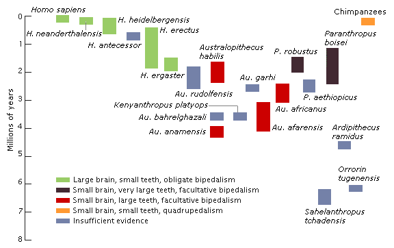
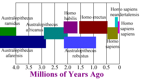
Here is another colorful presentation that leads one to ask questions. What is that gap between H. habilis and H. erectus? Temporally they overlap
in some of the cladograms shown above, but are placed in separate genera by some authors. And what's that business with Homo sapiens? Is the brown
supposed to represent Archaic H. sapiens which budded off H. neanderthalensis and Modern Homo sapiens? H. s. sapiens appears to be
equally derived from neanderthalensis and that brown H. sapiens. I'd love to hear the explanation for this.
Maybe it has something to do with multiregional hypotheses.
 |
| Further Reading in Taxonomy and Cladistics |
|
Primate Taxonomy : Primates are divisible into numerous
biological taxa on several levels. There are several possible taxonomical systems, and these have changed over time. The following classification
is a simplified version of Jolly and White, 1995, Physical Anthropology and Archaeology, Fifth Edition.
|
Books | Botany | Cell Biology | Chemistry | Creationism | Current News | Darwiniana
Dict. / Encyclo. | Ecology | Education | Essays | Eugenics | Evolution | Fossil Record
Genetics | Geology | Gouldiana | Health | Homework | Human Origins | Intermediates
Math | Museums | Origin of Life | Paleontology | Photos | Physics | Reference Aids
Science Journals | Sociobiology | Taxonomy | Transitionals | The Universe | Zoology
trees.htm Last Updated April 22, 2024 Links verified April 22, 2024